The Antlers – Kettering

Kettering by Brooklyn based indie rock group The Antlers is a truly touching track that will pluck on the heartstrings of anyone remotely compassionate. This unofficial video with its nicely edited scenes makes the track even more emotionally unsettling.

the video is comprised by a selection of scenes from Mr Nobody, a science fiction movie released in 2009 and directed by Jaco Van Dormael.

You’ll be hard pressed to find a more powerful or touching combination, but as sad as this song is, it is something I have listen to countless time in the past and I still find it to be a great track.
Ligatures

lig.a.ture – The act of tying or binding.

Since the creation of moveable type ligatures have taken on a more technical definition which is when two or more letters are cast together to create one sort (or glyph), this is considered a ligature even though the letters may not necessarily be connected as one letterform, but they still occupy a single glyph, which can be difficult to distinguish by eye.

Why use ligatures?

There are two main classifications for ligatures, these are typographic ligatures and orthographic ligatures and within typographic ligatures, we have two sub groups, standard and discretionary[1].

Typographic ligatures

typographic ligatures are connected for typographic reasons, these are mainly to avoid letters colliding in digital typography or to save time with hand set type and to prevent damaging type where parts may overhang from the sort and get chipped or bent over time.

Standard ligatures

Standard latin ligatures

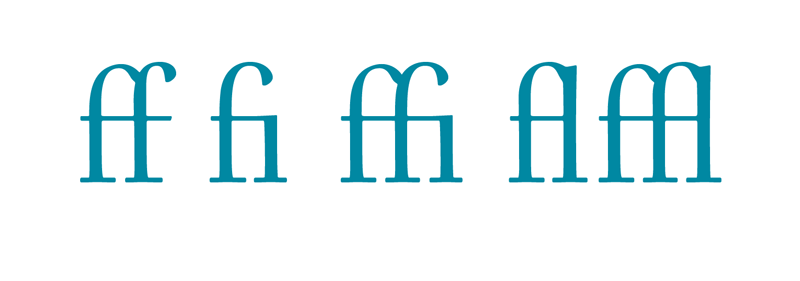
ff fi fl ffi & ffl are considered as standard ligatures in the latin alphabet because they appear together most commonly. They are found on most fonts nowadays but not always since type designers have begun to designer their type in ways that prevent letters from clashing and colliding. Many still provide ligatures though as an optional extra to add style and refinement.

Discretionary Ligatures

Non latin ligatures

ch, ck st & sp considered to be discretionary ligatures and are used as a stylistic addition and can be used to show additional refinement.

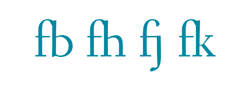
These are common because early european fonts where primarily designed in latin and the sequences mentioned are common, but sequences such as fb fh fj & fk do not occur but as the craft spread throughout Europe regional ligatures began to appear.

  • fj & ae for Norway and Denmark
  • oe for France
  • ll for Spain
  • ij for Holland
  • ch for German
  • ffj for Iceland
  • ffj & fj for Scandinavia

Ligatures can also appear more often throughout italics as opposed to roman type because of the slight angle of the text, causing letters to further intrude on their neighboring spaces.

As an international language type designers are now beginning to include more and more of these ligatures in their latin alphabets.

Orthographic Ligatures

Orthographic ligatures, also called Grapheme

Orthography refers to the conventional spelling system of a language.

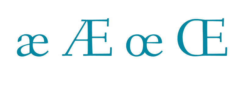
Orthographic ligatures are now considered to be conventional letters. the most obvious example of this is the letter w/W, historically it was derived from two v’s or u’s. Orthographic ligatures are not optional, they are now considered as standard writing practice. other examples of orthographic ligatures are ae/AE and oe/OE.

How to use them

when using ligatures it is imperative that you choose type that supports the language you are writing in. In Turkish for example an i with a tittle (the little dot) and an i without a tittle are two different letters, and the f on a ligature such as fi can sometimes obscure the tittle, change the spelling and word altogether.

In french the use of diacritics can alter the meaning of a word completely, so it is again important that your choice of type supports the language you are writing in[2].

When using Adobe applications such as Illustrator, InDesign and Photoshop you can gain access to these features by going to Window – type – open type. Here you are given the option to allow standard and discretionary ligatures, as well as several other typographic features.

If you allow the software to automatically insert ligatures it is advised to spend the extra time to ensure that it is inserting only the ligatures you want and that they stay where they are place, there are additional options in the Opentype tab that accommodate for this.

Web Typography

Until recently the use of opentype features on the web had been virtually non-existent, but with the release of the @font-face value, the slow but steady increase in browser support for opentype features and web font hosting companies like Typekit and Font Deck, we are finally seeing an increase in rich web typography.

I will cover this in much more detail in a later article but for now, you can enjoy a brief introduction to The New Web Typography.

Foot notes

  1. [1] Ralf Herrmann, 20/11/2012, Typographic Myth Busting: What’s a Ligature, Anyway? | Ralf Herrmann: Wayfinding & Typography [Ralf Herrmanns TypoBlog], [online]. Available: http://opentype.info/blog/2012/11/20/whats-a-ligature/ [06/08/2013].
  2. [2] Laura K. Lawless, n.d., French Accent Homographs [Learn French at About – Free French Lessons], [online]. Available: http://french.about.com/od/vocabulary/a/ accenthomograph.htm [06/08/2013].
  3. I Love Ligatures.

Tribal Alliances & Families in Type

To many people the selection of font weights and styles is simply an aesthetic choice, intended to serve the contents needs, but in actuality there are rules and guidelines to follow that determine which weights and styles should and can be used together.[1]

“To the marriage of type and text, both parties bring their cultural presumptions, dreams and family obligations, accept them.”

-Robert Bringhurst, The Elements of Typographic Style

Historical Origins & Development

There is a rich and diverse history behind the combining of font weights and styles, upper case and lower case letters have been around for over 1,000 years, but they haven’t always been used together.

Originally text was set in uppercase and over time, hand writing eventually transformed capitals into simpler more round letter forms that became our lower case alphabet. It wasn’t until much later that the two began to be used together and it was only during the late renaissance that typesetters began to combine roman and italics, before that italics had been reserved only for prefaces, headnotes, side-notes and block quotes.

Bold and condensed typefaces originated in the late 18th century and have been used more and more to replace headings and italics, especially on screen where italic texts can be harder to read.

The points mentioned are important to note because many older typefaces that have since been reproduced digitally now include these new weights and styles which did not exist at the time of their initial creation, so staying true to the original form means omitting these newer additions.

There is help though to aid the designer in choosing combinations that compliment the original forms and stays true to the established hierarchal rules that can make your content look and feel more harmonious.

Tribal Alliances & Families

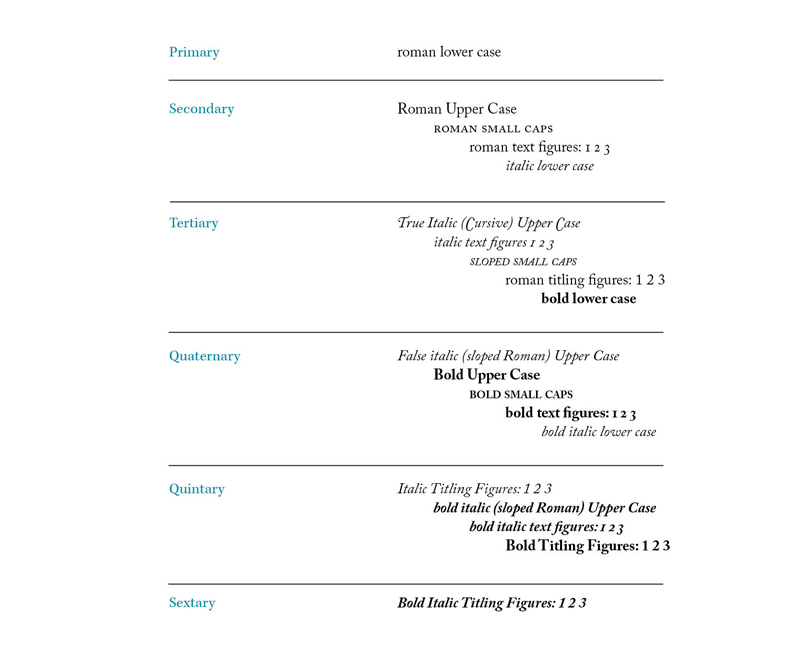
Figure 1. Tribal alliances and families in typefaces.

Figure 1 serves to show how each style and weight is categorised.

Grammatical road map

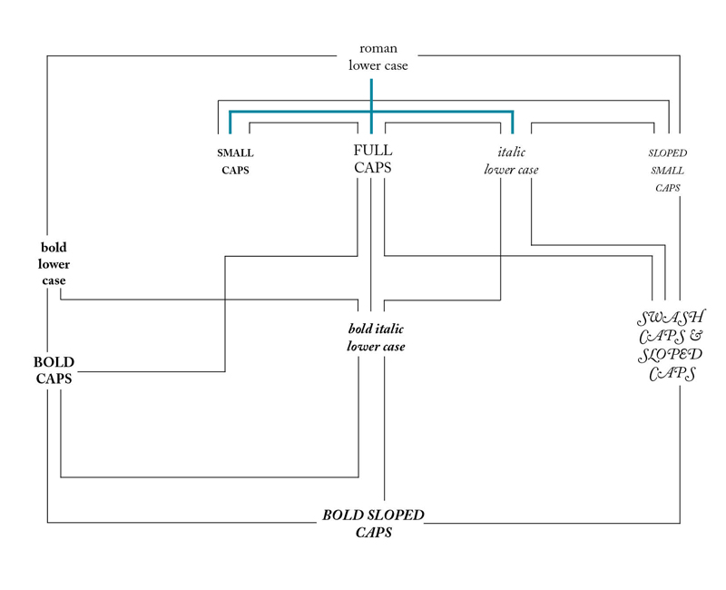
figure 2. Grammatical road map of conventional large family of type.

Figure 2 shows how styles and weight should be combined. The blue line represents the primary type family and the dark line shows the extended secondary family. By following the diagram it’s acceptable to use roman lower case along with bold lower case, small caps, full caps and italic lower case, but not bold italic lower case, bold caps, swash caps or sloped small caps. Doing so disrupts conventions of typographic grammar.[2]

Using styles & weight Correctly

With such a wealth of weights and styles it can be tempting for people to feel that they should utilise all features of a typeface, but the grammatical road map helps show otherwise and it’s wise to change only one parameter at a time as stated in Robert Bringhurst’s Elements of Typographic Style.

To create balance on a page the weight of larger text sizes should slightly decrease in comparison to the body text, this can help prevent the eyes from becoming distracted by strong headlines that demand attention.

When using bold text it’s advised to keep punctuation in the background, i.e roman, since it’s the word or sentence you are drawing attention to, not the punctuation. However, when spelling in italics it’s advised to keep punctuation in italics too, since letterforms may collide or look out of place next to punctuation that’s set in roman.

Following the rules and guides laid out in this article will help your content establish a visual typographic grammar that is balanced and harmonious, improving the overall design, composition and readability of your content.

Foot Notes

  1. [1]Robert Bringhurst, 2004. The Elements of Typographic Style. Version 3.2 USA: (pp.53-69). Hartley and Marks Publishers.
  2. [2]Mark Boulton, 18/05/2005, Five simple steps to better typography – Part 5 | Journal | The Personal Disquiet of Mark Boulton [Mark Boulton], [online]. Available: http://www.markboulton.co.uk/journal/five-simple-steps-to-better-typography-part-5 [06/08/2013].

Line Lengths & Measures

When designing how content should be displayed an important factor to consider is line length. If it’s too short the eyes can become tired from constantly moving to the next line, if it’s too long the reader can get lost in the middle of a sentence and it becomes difficult to find the next line.

Follow The Rule

To address this a recommended rule to follow is to aim for line lengths of around 45-75 characters[1], this includes spaces and punctuation too. In well set pieces of text 75 characters and more can be acceptable, but it is wise to avoid in cases of continuous text.

An example of this can be found on Nina Stössinger’s homepage. On my 24″ display it contains character lengths of 75-82 per line, and on Mark Boulton’s website I found that his character count reaches as much as 97 on some lines. Having said that, the relatively large font size he uses does help compensate for this, but I still wouldn’t advise it when reading large bodies of text.

Traditional type has always been measured vertically in picas and points. A pica is about 1/72 of a foot (4.23333333 millimetres) , or 1/6 of an inch and 1 pica is equal to 12 points (1pt = 0.3527777775 millimetres). The horizontal space of a line is measured in ems, which is a relative measurement. For example if your font size is 16pt then 1em = 16pt, if it’s 12pt then 1em = 12pt, so it is relative to your font size.

Relative Measurements

Ems are particularly useful measurement when setting the width of a body of text because you can give it a width that is relative to the font size. This is ideal because Robert Bringhurst states that the optimum width actually depends on your font size.

“Define the word space to suit the size and natural letterfit of the font”

-Robert Bringhurst, The elements of Typographic Style

The first step to working out this ideal measurement is to decide on a font size for your main body of text, I like to play around with sizes to find the sweet spot at which my chosen font looks best. Once you have a font size measure the length of your fonts lowercase alphabet, abcdefghijklmnopqrstuvwxyz[2]. An acceptable average is 30pts, but if you want to be thorough it’s best to just measure the lowercase alphabet each time.

When you have your measurement you then multiply it by your ideal font size then divide by 12 (1 pica). So it will look something like this.

30×12 = 360/12 = 30 picas

So our lowercase alphabet length is 360pts and our line length in picas is 30. We now take our measurements to a copyfitting table, I use the one provided on page 29 (version 3.2) of Robert Bringhurst’s The Elements of Typographic Style, if you don’t have your own copy then I strongly suggest you purchase one, but for now you can find a table at Tex-programmer[3].

It can be tricky to comprehend at first but the numbers down the left are your lowercase alphabet lengths and the numbers running across the top are your line lengths in picas. Simply find where the lines meet and you should have your ideal line length, mine was 30em.

Responsive Frameworks

When it comes to designing content for the screen, the designer has much less control over the appearance of their content and will ultimately have to allow for a certain level of flexibility. We will cover this separately and in much more detail in our next article.

Footnotes

  1. [1]Christian Holst, 01/11/2011, Readability: the Optimal Line Length [Baymard Institute], [online]. Available: http://baymard.com/blog/line-length-readability [18/07/2013].
  2. [2]Robert Bringhurst, 2004. The Elements of Typographic Style. Version 3.2 USA: (pp.17-29). Hartley and Marks Publishers.
  3. [3]Unknown, 07/03/2008, Tex: Number of characters per line in LaTeX – tex-program.itags.org [Tex-Programmer], [online]. Available: http://tex-program.itags.org/q_tex_133907.html [07/08/2013].