Basic Terminology
Throughout all the type related articles on this website there are many different terms used to describe specific aspects of typography. Many of them are explained since most articles are focusing on a specific aspect of typography, but this article will focus on covering the more generalised terms, to ensure readers have a solid understand of the basic terminology in a discipline that is rich with its own language.
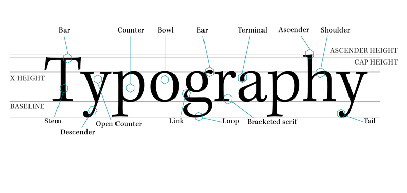
Figure 1. Characteristics and terminology.
Figure one shows a diagram containing common characteristics in a typeface. The more familiar you become with them, the easier it will become to talk about and recognise various fonts on sight.
Some of the labeled details are explained below along with some extra definitions that will any anyone on their way to learning the basics.
Baseline
The baseline is the line at which text appears to sit on. Some rounded letters like u, o and g may slightly extrude past this line but doing so allows for a much more natural looking letter form.
X-height
The X-height is the line at which the top of a lowercase x appears to sit under, this is relative to the font and is generally the same height for all other lowercase letters too.
Cap Height
The cap height is the line at which all capital letters rest, which is slightly smaller than the ascender line.
Ascender line
The line slightly above the cap height. Letters such as l, h, b and d have stems that are slightly taller than the height of capital letters.
Descender
Descenders are strokes that go below the baseline, such as in the letter j, y, g, p and q.
Diacritics
Diacritics are ancillary marks or lines that are added to a letter in the latin alphabet to change the sound value of letters, this is much more common in other european languages that aren’t english.
Leading/Line height
The space between lines of text, referred to as leading because in traditional typesetting strips of lead were used to space lead, this is now more commonly referred to as line height on the screen. A typical practice is to set the line height at 1.4 times the font size, but this can sometimes be set larger too, particularly in sans-serif fonts.
Point
Points are used to measure the size of a font, one point is equal to 1/72 of an inch. When type is set at 12pt, it is 12pt from the bottom of the character box to the top, which can be slightly larger than the actual letters themselves, so as a result two different fonts set in 12pt type may not necessarily be exactly 12pt.
Kerning
Kerning is the reduction or increasing of space between individual letters to make them appear more solid, or to give specific letters a little extra breathing space.
Tracking/letter spacing
tracking is the consistent spacing between letters in a word or block of text that affect it’s over all density and texture. It is not advised to track body text at all, except under exceptional circumstance.
There are many, many more samples of terminology in typography, but these are mostly considered the basics, and once learnt they can easily be built upon and really help people to develop a much deeper understanding of what typography is and how to effectively use it. For a much more comprehensive list of terminology check out FontShops Typographer’s Glossary[1].
Footnotes
- [1]Unknown. (Unknown). Typographer’s Glossary. Available: http://www.fontshop.com/glossary/. [16/08/2013].