Eames Century Modern

Eames Century Modern type sample

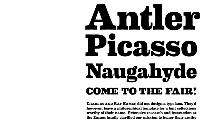
Figure 1. Eames Century Modern type sample.

Erik Van Blokland, creator of the infamous Beowolf font and House Industries teamed up to create Eames Century Modern, a stunning typeface that pays homage to Charles and Ray Eames.

Charles and Ray Eames are by far the most well known designers of modern architecture and furniture of the 20th century. Eames Century Modern pays close attention to the aesthetic values they were renowned for working towards.

The font boasts a wealth of styles and characters with 26 Fonts, an 18-Style text family with italics, nine Figure Styles, Advanced Text Handling, four Numeral Fonts, three Frame Fonts and Smart Ornaments Font. This is a truly impressive collection.

Choosing a Typeface

Choosing a typeface can be incredibly daunting and even overwhelming for those who are unfamiliar with the relevant theory, it should never be a case of choosing your favorite typeface simply because it’s your favorite. Each typeface is designed to serve a specific purpose and they each carry their own qualities and unique characteristics, that can be significant factors when deciding whether they will be chosen or not.

There can be a staggeringly high level of detail taken into consideration when choosing a typeface too, from choosing type that matches the same minute details of the content, right down to even the religion of the type designer[1], of which only the most experienced typographers could be aware of, but for the sake of this introductory article I will refrain from jumping in at the deep end.

Where to start?

It’s important in any project that you read any available content before-hand, to understand what it’s about so that you can make the choices that best reflect the needs and qualities of the content. So if for example you were designing a booklet for 18th century English houses, you could start by looking at 18th century typefaces that were designed by type designers from the same time period.

Likewise, the choice would also differ if you were designing a website for 18th century English homes, you would need to choose a typeface that displayed well on screen, and not all typefaces work as ideally in print and screen together. In these situations it’s important to be aware of the constraints of the medium you are working on. I briefly covered this in a previous article titled Introducing Responsive Typography[2].

Another area to look into is what the content is trying to convey, is it trying to reflect honesty, elegance, or is it representing a large corporation that wishes to remain impersonal? Look for typefaces that posses the same qualities and experiment by setting the content in these typefaces to get a clearer idea of how it will look.

Another aspect to take into consideration is the technical requirements of the text. Are there a lot of numerals in it? If so you would want to search for a typeface than contains particularly well designed titling and text figures[3]. If you need to be able to use small caps then you need to look for a typeface than contains them. These are vital factors to consider when deciding which typefaces you want to use.

Possibly breaching into the slightly more detailed requirements but if you want to remain true to traditional type then it’s also recommended that you use the same trends and layouts that were available at the time too, so if you were working from the previous example of 18th century English houses, you might also want to look at how typographers from that era designed their layouts.

Food for thought

These are standard considerations for anyone who wants to create rich and meaningful typography and at the same time stays true to the high standards of typography. They are also valid considerations when looking to combine type, but things get into even more detail when you start doing that, So I’m going to leave that for a later article.

Footnotes

  1. [1] Robert Bringhurst, 2004. The Elements of Typographic Style. Version 3.2 USA: (pp.99-100). Hartley and Marks Publishers.
  2. [2] Phillip Patterson, 04/08/2013, Introducing Responsive Typography [Type & Music], [online]. Available:http://typeandmusic.com/introducing-responsive-typography/ [18/08/2013].
  3. [3] Robert Bringhurst, 2004. The Elements of Typographic Style. Version 3.2 USA: (pp.95-96). Hartley and Marks Publishers.

Olej

Olej, Walks EP CD artwork

Figure 1. Olej, Walks EP cover art

Hailing from Naberezhnye Chelny, in Russia, and DJing under the alias Olej, Олег Мищихин produces some really amazing electronic music.

He describes his music as “amateur Deep Music”, but in my opinion it is far from it. His tracks have trademark soothing and hypnotic beats to them that have strong similarities with the minimalist deep-house genre. I highly recommend his Walks EP, and Airport.

You can find him on just about any social networking website, but I suggest visiting soundCloud first. You can hear the majority of his music there, and there are links to the rest of his accounts as well.

Hanging Punctuation

hanging punctuation sample

Figure 1. Hanging punctuation sample.

Hanging punctuation is the practice of placing punctuation and bullet points outside of the flow of text. When this is ignored or done incorrectly it breaks the flow of text[1].

Without Hanging Punctuation

You can see below in the sample quote how the initial quotation mark sits inline with the text and knocks the letter B (first line) out of alignment with the first letters at the start of each additional line.

“But just as a good musician can make a heart-wrenching ballad from a few banal words and a trivial tune, so the typographer can make poignant and lovely typography from bibliographical paraphernalia and textual chaff.”

—Robert Bringhurst, The Elements of Typographic Style.

With Hanging Punctuation

You can see here that the initial quotation mark and the em dash below the quote are now sitting outside of the box of text they occupy.

“But just as a good musician can make a heart-wrenching ballad from a few banal words and a trivial tune, so the typographer can make poignant and lovely typography from bibliographical paraphernalia and textual chaff.”

—Robert Bringhurst, The Elements of Typographic Style.

Lists

Lists are another item that hanging punctuation can be applied to. By default on this website lists are not indented, so I don’t need to worry.

  • Robag Wruhme
  • Monkey Safari
  • Disclosure
  • Owsey

How to hang your punctuation

For this example I created a simple class named .hang.


.hang{ text-indent: -.4em;}

It’s best to play around with the actual measurement because it will vary depending on your font size, but in my case -.4em worked nicely.

A more effective way of doing it would be to simply add the text-indent property to the blockquote, ol and ul elements, but for the sake of this exercise and to show correct/incorrect examples I decided to create a class instead.

There’s also a relatively new CSS3 property called hanging-punctuation[2] that will eventually make things much easier, but so far support for it is limited across all browsers.

hanging-punctuation:;

It works by allowing users to select bwtween the values none, first, last, force-end and allow-end. Each of these will be explained in turn.

none

The default value of the property, it simply means no character hangs outside the flow of text.

first

Recognised characters at the start of the selected element will hang outside of the text.

last

Recognised characters at the end of the selected element will hang outside of the text.

force-end

Punctuation is forced to hang at the end of a line and is not measured when justifying text.

allow-end

Here punctuation is allowed to hang at the end of a line if it doesn’t fit with justified text.

Footnotes

  1. [1]Mark Boulton, 18/04/2005, Five simple steps to better typography – Part 2 | Journal | The Personal Disquiet of Mark Boulton [The Personal Disquiet of MARK BOULTON], [online]. Available: http://www.markboulton.co.uk/journal/five-simple-steps-to-better-typography-part-2 [17/08/2013].
  2. [2]Chris Coyer, 11/08/2013, hanging-punctuation | CSS-Tricks [CSS-Tricks], [online]. Available: http://css-tricks.com/almanac/properties/h/hanging-punctuation/ [17/08/2013].

Little Dragon

Still capture of Little Dragon from the youtube video Little Dragon - Summertearz

Figure 1. courtesy of Little Dragon – Summertearz..

Arguably one of my favourite music acts to date, Swedish based electronic indie pop group Little Dragon have an amazing sound and a beautiful voice supplied by Yukimi Nagano, which gives them a very unique aspect.

To date they have released three studio albums, Little Dragon 2007, Machine Dreams 2009 and Ritual Union 2011. They have also appeared on Gorillaz 2010 release Plastic Beach. They manage to perfectly combine gorgeous vocals with an electronic style that is truly unique to themselves.

I’m not usually a fan of vocals in my music, but Little Dragon have completely captivated me since I started listening to them. Their track Never Never is what initially caught my attention and it’s my favourite track of theirs by a mile, I’ve yet to get sick of it.