Ligatures
lig.a.ture – The act of tying or binding.
Since the creation of moveable type ligatures have taken on a more technical definition which is when two or more letters are cast together to create one sort (or glyph), this is considered a ligature even though the letters may not necessarily be connected as one letterform, but they still occupy a single glyph, which can be difficult to distinguish by eye.
Why use ligatures?
There are two main classifications for ligatures, these are typographic ligatures and orthographic ligatures and within typographic ligatures, we have two sub groups, standard and discretionary[1].
Typographic ligatures
typographic ligatures are connected for typographic reasons, these are mainly to avoid letters colliding in digital typography or to save time with hand set type and to prevent damaging type where parts may overhang from the sort and get chipped or bent over time.
Standard ligatures
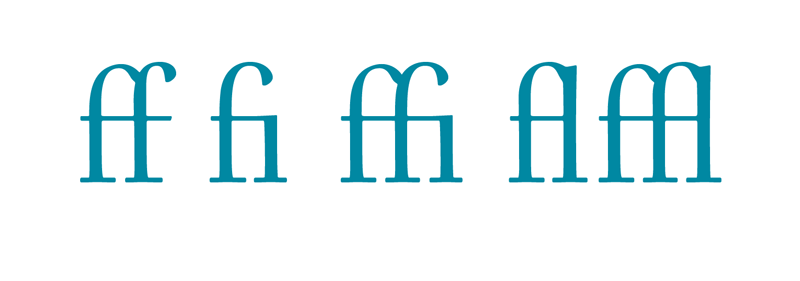
ff fi fl ffi & ffl are considered as standard ligatures in the latin alphabet because they appear together most commonly. They are found on most fonts nowadays but not always since type designers have begun to designer their type in ways that prevent letters from clashing and colliding. Many still provide ligatures though as an optional extra to add style and refinement.
Discretionary Ligatures
ch, ck st & sp considered to be discretionary ligatures and are used as a stylistic addition and can be used to show additional refinement.
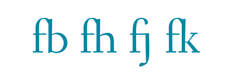
These are common because early european fonts where primarily designed in latin and the sequences mentioned are common, but sequences such as fb fh fj & fk do not occur but as the craft spread throughout Europe regional ligatures began to appear.
- fj & ae for Norway and Denmark
- oe for France
- ll for Spain
- ij for Holland
- ch for German
- ffj for Iceland
- ffj & fj for Scandinavia
Ligatures can also appear more often throughout italics as opposed to roman type because of the slight angle of the text, causing letters to further intrude on their neighboring spaces.
As an international language type designers are now beginning to include more and more of these ligatures in their latin alphabets.
Orthographic Ligatures
Orthography refers to the conventional spelling system of a language.
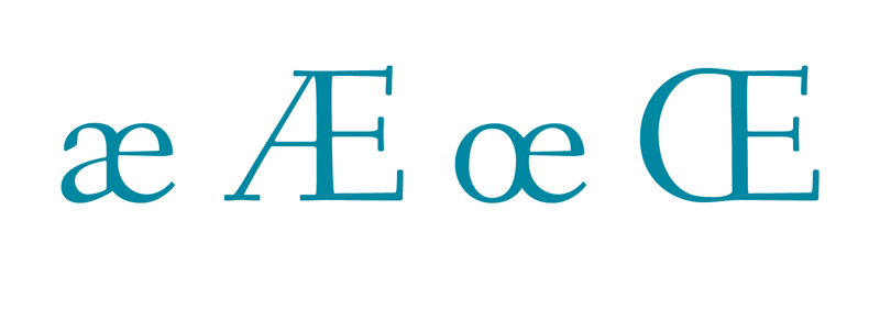
Orthographic ligatures are now considered to be conventional letters. the most obvious example of this is the letter w/W, historically it was derived from two v’s or u’s. Orthographic ligatures are not optional, they are now considered as standard writing practice. other examples of orthographic ligatures are ae/AE and oe/OE.
How to use them
when using ligatures it is imperative that you choose type that supports the language you are writing in. In Turkish for example an i with a tittle (the little dot) and an i without a tittle are two different letters, and the f on a ligature such as fi can sometimes obscure the tittle, change the spelling and word altogether.
In french the use of diacritics can alter the meaning of a word completely, so it is again important that your choice of type supports the language you are writing in[2].
When using Adobe applications such as Illustrator, InDesign and Photoshop you can gain access to these features by going to Window – type – open type. Here you are given the option to allow standard and discretionary ligatures, as well as several other typographic features.
If you allow the software to automatically insert ligatures it is advised to spend the extra time to ensure that it is inserting only the ligatures you want and that they stay where they are place, there are additional options in the Opentype tab that accommodate for this.
Web Typography
Until recently the use of opentype features on the web had been virtually non-existent, but with the release of the @font-face value, the slow but steady increase in browser support for opentype features and web font hosting companies like Typekit and Font Deck, we are finally seeing an increase in rich web typography.
I will cover this in much more detail in a later article but for now, you can enjoy a brief introduction to The New Web Typography.
Foot notes
- [1] Ralf Herrmann, 20/11/2012, Typographic Myth Busting: What’s a Ligature, Anyway? | Ralf Herrmann: Wayfinding & Typography [Ralf Herrmanns TypoBlog], [online]. Available: http://opentype.info/blog/2012/11/20/whats-a-ligature/ [06/08/2013].
- [2] Laura K. Lawless, n.d., French Accent Homographs [Learn French at About – Free French Lessons], [online]. Available: http://french.about.com/od/vocabulary/a/ accenthomograph.htm [06/08/2013].
- I Love Ligatures.