OpenType Features For the Web

In recent years we have seen a huge increase in the capabilities of web typography, from the release of the @font-face feature to the launch of web-font hosting specialists such as Typekit and Fontdeck, among others. We have also seen an exciting increase in web-fonts with OpenType features and increasing support for these across major browsers too, which is the main focus of this article.

This article expands on topics covered in two previous articles on the Type & Music website, Ligatures[1] and Numerals, Capitals & Small Caps[2].

OpenType features can be used to enhance web typography in the browser by enabling Ligatures, Numerals and Small Caps, which are the focus of this article.

It’s important to note that support for OpenType fonts and support for OpenType features are two different things. OpenType fonts are supported in more recent versions of all major browsers, whereas support for OpenType features is only available in FireFox v4+, ie 10 preview and Chrome 15+ as of the writing of this (7th August 2013).

There are also two levels of control available in the CSS3 font specification, these are high level support font-variant and low level support font-feature-settings, but so far only the low level attribute is supported by the browsers mentioned above, but I will provide samples of both throughout.

OpenType CSS Specifications

There are many different features to implement with the latest specification[3]. I’ll be covering the most common features that I’ve mentioned in previous articles, but the rest are in principle the same.

Ligatures

High-level Syntax

font-variant-ligatures: common-ligatures;
font-variant-ligatures: no-common-ligatures;

font-variant-ligatures: discretionary-ligatures;
font-variant-ligatures: no-discretionary-ligatures;

In samples above you can see the code to activate (common-ligatures/discretionary-ligatures) and to deactivate ligatures (no-common-ligatures/no-discretionary-ligatures).

Low-level Syntax

-moz-font-feature-settings: “liga=1”, “dlig=1”;
-web-kit-font-feature-settings: “liga” on, “dlig”;
-o--font-feature-settings: “liga”, “dlig”;
font-feature-settings: “liga” on, “dlig”;

This would enable standard (lig) and discretionary ligatures (dlig) on your website. At present we still need to rely on vendor prefixes and although Opera at present does not support such features, it is wise to include it anyway for when they eventually do begin to offer support.
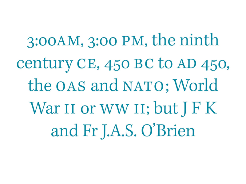
Small Caps

To enable small caps on your website you can use the following code.

High-level Syntax

font-variant-caps: small-caps;

Low-level Syntax

-moz-font-feature-settings: 'smcp=1';
-ms-font-feature-settings: "smcp";
-webkit-font-feature-settings: "smcp";
-o-font-feature-settings: "smcp";
font-feature-settings: “smcp;
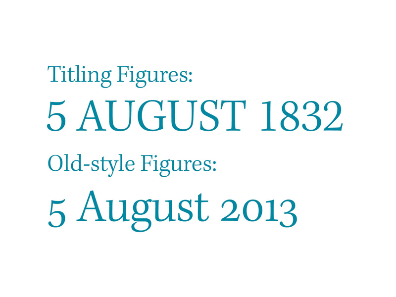
Numerals

To enable Old-style numerals use the following code.

High-level syntax

font-variant-numeric: oldstyle-nums;

Low-level Syntax

-moz-font-feature-settings: “onum=1”;
-ms-font-feature-settings: “onum”;
-webkit-font-feature-settings: “onum”;
-o-font-feature-settings: “onum”;
font-feature-setting: “onum”

To enabling lining figures, use the following code.

High-level syntax

font-variant-numeric: lining-nums;

Low-level Syntax

-moz-font-feature-settings: “lnum=1”;
-ms-font-feature-settings: “lnum”;
-webkit-font-feature-settings: “lnum”;
-o-font-feature-settings: “lnum”;
font-feature-settings: “lnum”;

To enable tabular figures use the following code.

High-level Syntax

font-variant-numeric: tabular-nums;

Low-level Syntax

-moz-font-feature-settings: “tnum=1”;
-ms-font-feature-settings: “tnum”;
-webkit-font-feature-settings: “tnum”;
-o-font-feature-settings: “tnum”;
font-feature-settings: “tnum”;

As previously mentioned there is limited support for these features amongst browsers at present, but it would be smart to set everything in place now, so that when they do become available, you’ll already have everything you need in place.

At present there are alternatives to the lack of support. Monotype have released a beta version of their new cloud technology solution through fonts.com[4]. This service takes information from the GSUB(glyph substitution table) table and complies it into javascript code that can be implemented by any browser with it enabled.

Footnotes

  1. [1]Phillip Patterson, 06/08/2013, Numerals, Capitals & Small Caps [ Type & Music ], [online]. Available: http://typeandmusic.com/numerals-capitals-small-caps/ [07/08/2013].
  2. [2]Phillip Patterson, 03/08/2013, Ligatures [ Type & Music ], [online]. Available: http://typeandmusic.com/ligatures/ [07/08/2013].
  3. [3]Gustavo Ferreira, 06/05/2012, Typotheque: OpenType features in web browsers — Tests by Gustavo Ferreira [Typotheque type foundry – high quality fonts for print and web], [online]. Available:https://www.typotheque.com/articles/ opentype_features _in_web_browsers_-_tests [07/08/2013].
  4. [4]Sampo Kaasila, 23/01/2013, OpenType Feature Support Now Possible in Nearly Any Browser « fonts.com blog [ fonts.com blog], [online]. Available:http://blog.fonts.com/2013/01/23/ opentype-feature-support-now-possible-in-nearly-any-browser/ [07/08/2013].

Numerals, Capitals & Small Caps

The correct use of numerals, capitals and small caps are essential for good typography. Unfortunately though, to many people they’ve become a complete oversight and the theory behind their correct usage has been all but forgotten.

Historical Context

The numerals we now use today are known as Arabic and Indian numerals. They originated around 300 BC and were later adopted by Arabs during the 2nd century BC, and were later integrated into use with latin alphabets, replacing roman numerals[1].

These arabic numerals were known as lower case figures or old-style figures because they ran in line with lower case text, unlike the titling figures many of us are accustomed to seeing nowadays. Text figures were common in European typography from 1540 to around 1800, but during the mid 18th century shopkeepers and merchants were writing numerals themselves, so eventually they developed their own proportions.

These figures became known as titling figures which are also known as ranging figures, lining figures and modern figures, whereas text figures are also called non-lining figures, lower case figures, hanging figures and Old-Style figures[2].

During the 19th century foundries stretched the smaller text figures to fit the full cap height and titling figures became a normal practice in commercial typography, despite the fact that this is bad typographic practice. Letter forms should never be stretched or squashed simply because it alters their original intended display.

During the early 20th century old-style figures underwent a revival of sorts in which they found their way back into use in books, but titling figures remained in news and advertising papers. The figures remained largely in exile or misuse though and with the arrival of computers and desktop publishing, many of these features were originally unavailable.

The correct use of these figures has since begun to prosper again, with Adobe and Microsoft working together in the 90s to create a digital font format known as OpenType, a format that supports the use of additional characters like Small caps, old-style numerals and ligatures. This is now supported on desktop applications by Adobe and Quark Express. In recent years there has even been increasing support for them in web browsers.

Correct Usage

There are a collection of guidelines that you can follow when setting type to ensure that you use each of these figures appropriately and each will be explained below.

Numerals

Correct usage for numerals

“The using of titling figures in running text is illiterate: it spurns the truth of letters.”

-Robert Bringhurst – The Elements of Typographic Style

When working with numerals use titling figures with full caps and text figures in all other circumstances. This helps maintain the flow of text, where titling figures to be used in the middle of body text or text figures in the middle of capitals, they would draw unnecessary attention to themselves and it’s ill advised in Robert Bringhurst’s The Elements of Typographic Style.

When using numerals in tables you can use OpenType features to switch between proportional numerals and tabular numerals, it’s possible to do this on both titling and old-style figures.

Capitals

Small caps and text figures in use

When using capitals in the middle of text a good rule to keep in mind is to use spaced small caps for abbreviations and acronyms, except for two letter geographical acronyms and acronyms that stand for personal names.

It’s important to realise too that small caps aren’t just shrunk Full caps, they are designed from the ground up just as roman, italic and upper case letterforms are.

* * *

Successfully implementing the features discussed here should mean you’re well on your way creating great typographic content. These features are easier to implement on desktop applications at the moment, and there is continuously improving support for them in the browser, which I’ll cover in much more detail in a later article.

Footnotes

  1. [1] Robert Bringhurst, 2004. The Elements of Typographic Style. Version 3.2 USA: (pp.46-49). Hartley and Marks Publishers.
  2. [2] undefined, 12/07/2013, Text figures – Wikipedia, the free encyclopedia [Wikipedia, the free encyclopedia], [online]. Available: https://en.wikipedia.org/wiki/Text_figures.

Introducing Modular Scales

The use of scales to aid composition originally surfaced in music [1] , they’re used to add structure and harmony to sound instead of just a series of incoherent noises. In typography they are used to create visual harmony and consistency throughout written documents.

Before reading any further, if you haven’t already watched Tim Brown’s video from Build 2010, or read his article on more perfect typography[2]. I highly recommend that you do since the topics are heavily related and it will help make more sense of using modular scales.

What is a Modular Scale?

“A modular scale, like a musical scale, is a prearranged set of harmonious proportions.”

—Robert Bringhurst, The Elements of Typographic Style

As Robert Bringhurst states, a modular scale is a set of prearranged harmonious proportions. These proportions are achieved by dividing or multiplying with a ratio, which will be explained later.

Why use a scale?

If you take this approach and start with type as Tim discussed in his video, it is possible to create a solid and visually harmonious foundation for any design. You’ll also have a selection of predefined measurements that compliment each other mathematically and can be used to create a clear visual harmony in your content.

How to Use a Modular Scale

To create a modular scale you need to first pick a number relevant to your design, the ideal font size of your chosen font is a great number to use. You then multiply or divide it by a ratio of your choice, for example a perfect fifth at 1.5 or the famous golden ratio at 1.618.

Fortunately for us we don’t need to manually multiply and divide all our numbers, we can just use Modular Scale a website that does the multiplications for us.

As explained in Tim’s video which was recommended at the start of this article, find a typeface that suits your content and then find a size at which it looks nice and crisp whilst displaying body content. This should be your ideal text size. I chose 21 for mine because I think my text looks particularly nice at that size.

Next, find an important number, this can be the size at which you think your header looks best, the ideal width of your measure, the width of your images, it could even be an ideal text size for display on mobile devices. I chose 617 because that’s the ideal length of my measure in pixels.

You can then multiply and divide each number by your chosen ratio to give you a double stranded scale. Using two values to create your scale is great because the values from one often fill in the gaps of the other. I chose to use the perfect fifth scale and you can see the scale that I ended up with.

Implementing The Scale

As Tim states, the modular scale is a tool, it is meant simply to aid and there is no substitute for the designers eye. I set my line height to 1.4em, which is not on the scale but it’s a size that I felt suited the text best.

It’s important to ensure that you are working from the correct base value when using a modular scale. CSS resets can alter your values if you are not careful so double check that there isn’t a font-size value set elsewhere in your CSS file that could override your own settings.

The modular scale works particularly well with the content out approach, this gives precedence to your content which is your most important assent on any website or document and it is the approach that I use nearly every time.

Footnotes

  1. [1]12/12/2006, 24 ways: Compose to a Vertical Rhythm [24 ways: web design and development articles and tutorials for advent], [online]. Available: http://24ways.org/2006/compose-to-a-vertical-rhythm/ [06/08/2013].
  2. [2]Tim Brown, 03/05/2011, More Meaningful Typography · An A List Apart Article [A List Apart: For People Who Make Websites], [online]. Available: http://alistapart.com/article/more-meaningful-typography [06/08/2013].

Prumo Text

Prumo text sample from DSType.

Figure 1. Prumo Text sample.

Prumo Text is one of many beautiful typefaces designed by DSType, an award winning and internationally renowned foundry. They have some of the finest examples of type design throughout their website, so be sure to check it out.

Prumo Text comes in ten weights, from hairline to black with matching italics too. It’s a highly functional typeface, I personally prefer the heavier weights where the form and contrast really start to shine through and it looks gorgeous when displaying a paragraph or two of text.

you can stunning type on DSType their website, they seems to have an incredible knack for creating amazing typefaces consisting of beautiful letter-forms that are also highly functional.

Introducing Responsive Typography

In a previous article titled Line Lengths & Measures I discussed the importance of achieving an ideal measure (line length) for your content, I also explained how to achieve this. The article you are now reading serves as an expansion on Line Lengths & Measures, so if you haven’t read it yet, take a look now before reading on.

Originally designers working with type had absolute control over the presentation of their content, how it looked when they set the type and printed it was exactly how everyone else would see it. Now in the digital age where most of our content is displayed on a screen, designers have less control over how it will appear to users.

Enter Responsive Design

Before responsive design emerged websites were limited to fixed or fluid layouts and had to rely on completely separate style sheets to serve up mobile devices and printable versions of the website.

Responsive design allows the designer to create a website that responds to the device it is being viewed on through the use of media queries.[1]

@media (min-width:1100px) { body {font-size:1.5rem;} }

Media queries consist of a media type and expressions that check to see if the users device meets these requirements, if these criteria are met, then any code within the query will come into effect, enabling designers to optimise their site and content for multiple displays and devices from a single stylesheet.

This is great for web typography because it means we can now optimise our content for a much larger selection of devices, but it still doesn’t give us the level of absolute control that traditional typographers had and it also means that we need to take a much bigger range of issues into consideration when making choices for factors like which font we’re going to use and how our measure will adjust to each device it is displayed on.

Key Factors in Responsive Typography

I’ve written a short section about the four main areas to consider when optimising a websites content for multiple devices.

Font Choice

It is now even more important that our choice of font be a versatile one. one that it capable of displaying text on small screens and sizes, whilst still remaining legible and readable, and still displays beautifully in larger screens too. A general guideline to follow is to use a font with a large x-height and relatively low contrast.

Font Size

It is largely accepted that a computer screen will usually be much further away from our face than a book or smart phone would be [2], so it is important to take this into consideration with various other devices too. Information Architects (iA) a design company based in Tokyo and Zurich cover this in great detail in their article The 100% Easy-2-Read Standard[3].

As a result slightly larger than normal font sizes have become the standard on contemporary websites, because of the larger screens and bigger distances from a user, whereas it is necessary to reduce the size to display optimally on smaller screens since the screen is much smaller and will be held much closer to the readers eyes.

Measure

As discussed previously, the ideal measure is between 50-75 characters, so this is something you should work out for each media query you use, so as to achieve the best reading experience on all devices. For smaller devices I think 50 is the maximum possible measure before the text become too small to be legible, some even argue that a slightly smaller measure than 50 characters is accept on particularly small screens.

Line Height

It has become a standard in web design to set the line height of content at 140% (1.4em) of the font size. this ensures a generous amount of breathing room between each line. If the line height is too small the reader can become lost in the middle of sentences and if it is too large it can become difficult to find new lines, which also it looks unsightly to a pages overall texture.

Designers also recommend that line lengths be slightly larger for sans-serif fonts and on smaller mobile screens it is advised to increase line heights slightly more to compensate for smaller text sizes and measures.

Responsive design does increase the accessibility of a sites design and its content but it doesn’t provide us with the same level of control that traditional typographers had. It’s still relatively flexible and content can still end up displaying in less than perfect circumstances but it is still important that the content we design is as accessible and readable as humanly possible.

Foot Notes

  1. [1]Chris Coyer, 06/07/2010, CSS Media Queries & Using Available Space | CSS-Tricks [CSS-Tricks], [online]. Available: Available: http://css-tricks.com/css-media-queries/ [06/08/2013].
  2. [2]Oliver Reichenstein, 01/06/2012, Responsive Typography: The Basics | Information Architects [Information Architects | iA designs and builds digital products.], [online]. Available: http://ia.net/blog/responsive-typography-the-basics/ [06/08/2013].
  3. [3]Oliver Reichenstein, 17/11/2006, The 100% Easy-2-Read Standard | Information Architects [Information Architects | iA designs and builds digital products.], [online]. Available: http://ia.net/blog/100e2r/ [06/08/2013].