Introducing Typographic Families

In order to create a successful typeface or even to use it effectively I think it’s vital to have at the very least a basic knowledge of the various typographic families and the many unique characteristics that set them apart from one another.

The most basic categorisations in type would have to be Serif and Sans-Serif. Serif typefaces have brackets and small extensions from the main stroke or body of each character to help lead the eye from one letter to the next, whereas Sans-serif (without serifs) typefaces lack these small extending features.

Other names and classifications for sans-serif include gothic and grotesk which are sometimes included in the name of a typeface, for example, League Gothic and Neue Has Grotesk.

Angle of Stress

Angle of stress

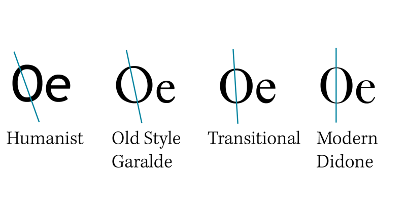
Figure 1. Angle of stress across type families.

The angle of stress is what determines contrast in type [1]. It relates back to the ancestry of calligraphic print. Wide nibbed pens that were used by scribes would create varying thicknesses of strokes depending on the angle they were held at by hand. By drawing a line through the thinnest strokes of a letter you can see the angle of stress on a font or typeface.

Typographic Families

Over the centuries there have been a number of major developments in typographic style, due to advancements in technology and thinking. Each of the major movements has be discussed in this article.

Blackletter

Blackletter type sample

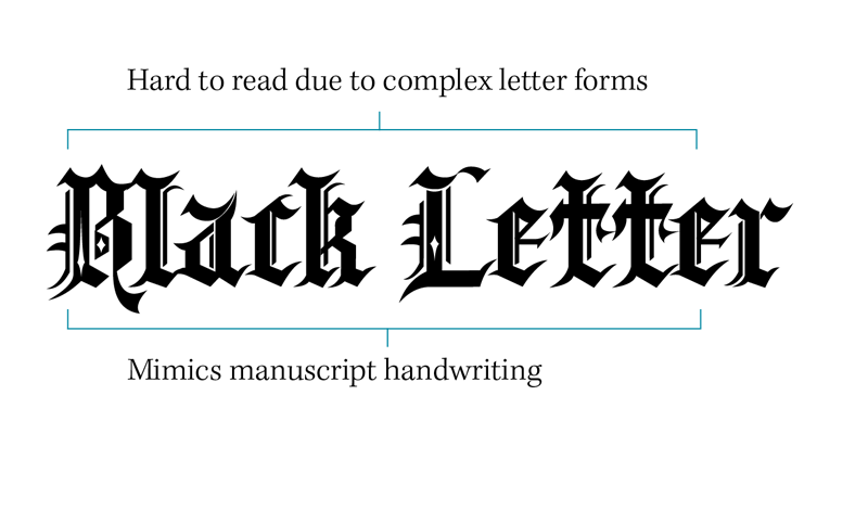
Figure 2. Blackletter type sample.

Blackletter, also known as gothic script or gothic minuscule was used throughout europe from the 1100s right up until the 17th century. They were the earliest typefaces to emerge along with the printing press and strictly resembled the manuscript writing of that time[2].

Because of the complex letterforms in gothic type they can be very hard to read and are rarely used today as they once were.

Blackletter Samples

Humanist

Humanist type sample diagram

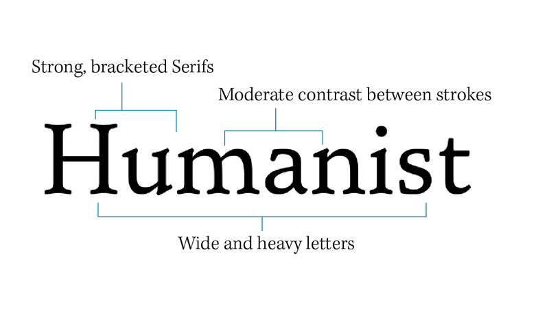
Figure 3. Humanist type sample.

Humanist typefaces, also known as Venetian were initially designed to imitate the handwriting of Italian renaissance scholars[3]. They can be characterised by their strong bracketed serifs. Generally the letters have a wide and heavy appearance, they have a square full point, small X-heights with a moderate contrast between the strokes and an acute angle of stress. Another defining feature can be the sloped crossbar on letters such as the lowercase e but this can vary in extremity.

Humanist Samples

Old Style

Garalde type sample diagram

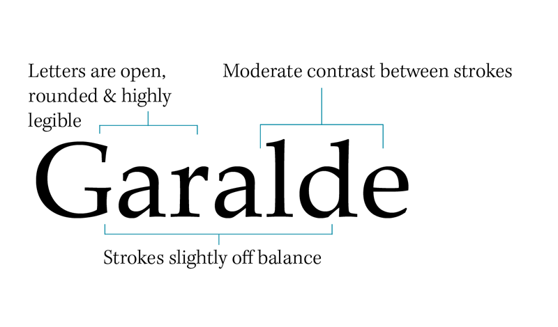
Figure 4. Old style type sample.

Old style typefaces, also known as Garalde mimic the hand held angle of pen nibs used by people. They are characterised by small X-heights, the letters are open and rounded making them very readable and the thick strokes of the curved letters are off balance.

The diagonal stress in the characters mimic the angle at which a pen is held by the human hand, instead of a vertical stress which would typically be expected of a machine, but less acute than in humanist typefaces[4]. It was also within this type movement that the first italics originated.

Old Style Samples

Transitional

Transitional type sample diagram

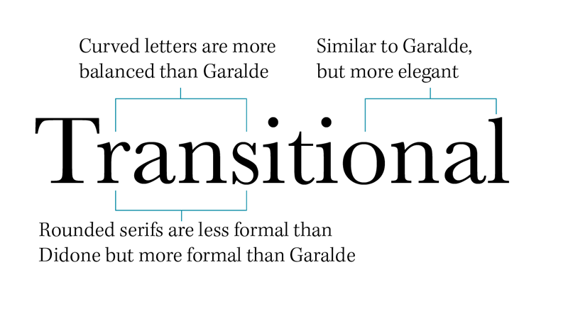
Figure 5. Transitional type sample.

Transitional typefaces, also known as Neoclassical are one of the most common typefaces. The name is derived from the transitional period in the 18th century where type designers began relying on mathematical and scientific principles to produce new letter forms[5].

Transitional typefaces combine properties from old style and modern typefaces. They have rounded serifs which are less formal than modern type but more formal than old style, indicating the transition. The curved letters are more balanced than Garalde and has a near vertical angle of stress due to the mechanical like structure.

Transitional Samples

Modern

Modern type sample diagram

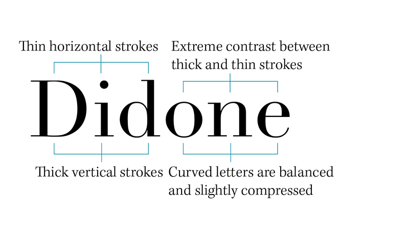
Figure 6. Modern type sample.

Also known as Didone, modern typefaces can be identified by the strong vertical emphasis and fine hairlines[6]. Modern typefaces have a vertical stress with long and fine serifs. There is an extreme contrast between the thick and thin strokes.

The curved letters are balanced and slightly compressed giving them a more structured appearance than the curved letters in old style type. The style has a vertical angle of stress and because of their fine strokes and serifs they do not handle well with reverse or stippling, except in large sizes.They can also be difficult to read on small screens and sizes.

Modern Samples

Slab Serif

Slab serif type sample diagram

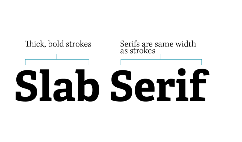
Figure 7. Slab Serif type sample.

Also known as Egyptian[7], Slab serifs have very little contrast between the thick and thin strokes. They have a bold, rectangular appearance and all characters occupy the same width. They are best suited for use in titles due to their low contrast. Although slab serif is a typographic classification for fonts, it is also a broad generalisation as there are many sub groups of slab serif fonts e.g. Clarendon, neo-grotesque and Italienne.

Slab Serif Samples

Sans-Serif

sans-serif type sample diagram

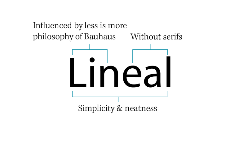
Figure 8. Sans-Serif type sample.

Also known as Lineal, the first sans-serif typeface originated in the early 1800s but it wasn’t until the 1920s that they started to become popular as a result of the less is more philosophy promoted by the German Bauhaus school of design.

Sans-serif fonts possess qualities of newness, simplicity and neatness because there is very little variation in the thickness and weight of the strokes. Lineal fonts are very popular because of ease of increasing and decreasing stroke thickness, and the ease of expanding or condensing.

Lineal Samples

Script

Script type sample diagram

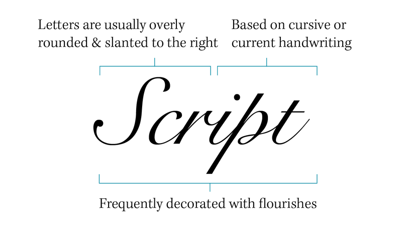
Figure 9. Script type sample.

Script typefaces mimic letterforms from the seventeenth and eighteenth centuries. Usually created by a quill or metal nibbed pen, they are able to generate both thick and thin strokes. Script fonts are often very elegant in appearance with large swashes and sit at a inclined angles to the right.

Script Samples

Decorative

Decorative type sample diagram

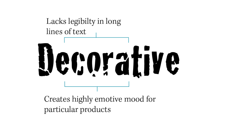
Figure 10. Decorative type sample.

Also known as novelty fonts. Decorative fonts are primarily designed to be used for words in display or headings where the product needs a close matching typeface. They are highly emotive and as a result their use is usually fairly restricted.

Decorative Samples

The List Goes On

You should now be capable of identifying and differentiating between typefaces more effectively than before. However, keep in mind that I have only covered the basics, these are only the main classifications and there are many other groups and sub groups within typographic families but for the purpose of this article I will refrain from going into any more detail.

Footnotes

  1. [1]Unknown, n.d., Axis [typography posters], [online]. Available: http://www.typographydeconstructed.com/axis/ [10/08/2013].
  2. [2]Jennifer Farley, 07/11/2009, The Blackletter Typeface: A Long And Colored History – SitePoint [SitePoint — Learn CSS | HTML5 | JavaScript | WordPress | Tutorials-Web Development | Reference | Books and More], [online]. Available: http://www.sitepoint.com/the-blackletter-typeface-a-long-and-colored-history/ [10/08/2013].
  3. [3]John Boardly, 06/11/2007, History of typography: Humanist | I love typography, the typography and fonts blog [I love Typography (ILT)], [online]. Available: http://ilovetypography.com/2007/11/06/type-terminology-humanist-2/ [10/08/2013].
  4. [4]John Boardly, 21/11/2007, History of typography: Old Style | I love typography, the typography and fonts blog [ I love Typography (ILT)], [online]. Available: http://ilovetypography.com/2007/11/21/type-terminology-old-style/ [10/08/2013].
  5. [5]John Boardly, 17/01/2008, History of typography: Transitional | I love typography, the typography and fonts blog [I love Typography (ILT)], [online]. Available: http://ilovetypography.com/2008/01/17/type-terms-transitional-type/ [10/08/2013].
  6. [6]John Boardly, 30/05/2008, A Brief History of Type Part four: Modern (Didone) [I love typography, the typography and fonts blog [I love Typography (ILT)]], [online]. Available: http://ilovetypography.com/2008/05/30/a-brief-history-of-type-part-4/ [10/08/2013].
  7. [7]John Boardly, 20/06/2008, A Brief History of Type—Part 5 | I love typography, the typography and fonts blog [fonts, typefaces and all things typographical — I love Typography (ILT)], [online]. Available: http://ilovetypography.com/2008/06/20/a-brief-history-of-type-part-5/ [10/08/2013].

Hierarchies & Grouping Content

When I began designing the article layout on this website I wanted to take a deeper look at what exactly Bylines, Footnotes and Side-notes are and how they differ from primary content. So, this article aims to enlighten others as to what they are to and provide some guidelines on their styling.

Typographic Hierarchy

Typographic hierarchy is established through the use of different typefaces, weights and styles, when structuring a document. I have covered aspects of this in previous articles, Working with Modular Scales[1] and Tribal Alliances & Families in Type[2], which are worth a read too.

Early European typographers created entire manuscripts with a single font, size and colour along with hand drawn illuminations. Although these manuscripts still look beautiful in their own sense, they are difficult to read, not just because of the complex black-letter forms they were set in, but because the content all looks the same, causing the reader to become easily lost and confused within the content due to the lack of land marks.

As the craft developed typographers began to incorporate different font sizes based on a scale. These different sizes originally had names of their own rather than pt sizes[3]. Nowadays though, with digital type people can set type in pretty much any size they want so the use of scales has been largely over looked. This is bad, but thankfully scales have re-emerged.

Common Elements

A system was eventually established to help break up content into more structured forms, through the use of crossheads, left side-heads and right side-heads. These components are now commonplace in typography and successfully help us distinguish between separate content and sections.

Crossheads serve as subheadings throughout an article and appear after the main text heading. They are positioned in the centre of the measure and are typically set in small caps, but styles can vary, within reason[4]. If the heading is set to the left or right then it becomes a side-head.

When establishing headings they should be used as supplements and not just breaks in content. They are supposed invite the reader to continue reading and lead them through the article. It’s also important never to use the same styles for a main head and a subhead that is intended to identify a subgroup within the main heading, this disrupts the hierarchy.

Differentiating Content

When you have established the hierarchy of your content, you also need to consider how you group different content as well. you can think in terms of main content as in the actual article content and supplementary content as the meta data or information about the article.

The main content will always be comprised of headings, subheadings and body text. You can think of bylines and footnotes/references as the supplementary content which should be visually distinguished from the primary content so that readers can easily differentiate between them.

Footnotes

Footnotes, also known as bibliographies are used to tell readers where you got your information from and where it is referred to within your content. It also serves to help anyone continue researching the topic further if they wish. Footnotes help add credibility to what you are saying and it shows that you aren’t just making stuff up.

One of the most intimidating factors for me when it comes to creating footnotes is the referencing. It’s so time consuming and I’m always worried that I’m doing it wrong, but a friend of mine developed ReferenceIt which takes most of the hassle out of referencing. It uses the Harvard referencing system, so if you use any other system this may not be applicable to you.

It’s very important that you reference any work you use when writing. If you take information in the form of quotes, ideas or even if you’re only paraphrasing, this will ensure that you are not accused of plagiarism.

Bylines

Bylines are used to display the author’s name, date of publication and other additional information like the authors profession or if the article is a revised edition or simply being republished again.

Bylines are traditionally placed between the main title and the content [5], but it’s also acceptable to place it at the very start or end of an article, as long as it remains consistent through all your articles. You can see the byline at the very start of all articles in this website, set in 19px Kepler Std light, 3px smaller than body text and in a much lighter colour to help distinguish it.

Footnotes

  1. [1]Phillip Patterson, 05/08/2013, Introducing Modular Scales [Type & Music], [online]. Available:http://typeandmusic.com/introducing-modular-scales/[09/08/2013].
  2. [2]Phillip Patterson, 01/08/2013, Tribal Alliances & Families in Type [ Type & Music ], [online]. Available:http://typeandmusic.com/tribal-alliances-families-in-type/ [09/08/2013].
  3. [3]Frank Romano, 01/09/2009, The History of the Typographic Point [Print History], [online]. Available:http://www.printinghistory.org/ publications/newsletter /APHA-newsletter-171.pdf [09/08/2013].
  4. [4]Mark Boulton, 18/05/2005, Five simple steps to better typography – Part 5 | Journal | The Personal Disquiet of Mark Boulton [Mark Boulton], [online]. Available: http://markboulton.co.uk/journal/five-simple-steps-to-better-typography-part-5 [09/08/2013].
  5. [5]undefined, 19/01/2013, Define byline [Dictionary and Thesaurus], [online]. Available: http://byline.askdefine.com/ [09/08/2013].

Trola

Trola sample image

Figure 1. courtesy of Catherine Dal.

Trola is a typeface from designer Jordi Embodas, it is a family related to Bulo. They share the same skeleton but are visually different.

A strong, sturdy looking typeface with unusual proportions that make it particularly good for use in larger sizes, it’s also designed so that it can fit into tight or limited spaces. It has a moderate contrast and to me, it really conveys a certain authority.

Trola comes in light, regular, semibold, bold and heavy so it has a wide range of possibilities and looks particularly eye catching in in bold italics.

Designer Jordi Embodas is also the creator of Orenga typeface, Pona typeface and Textosterona, be sure to check them out on his website and you can get a nice overview of Trola on the MyFonts website as well.

Portico Quartet

Portico Quartet Photo.

Figure 1. Portico Quartet band image.

Four piece contemporary modern Jazz band Portico Quartet are a london based group with a beautifully unique and refreshing approach to Jazz.

The band consists of members Jack Wyllie – Soprano and tenor saxophone player, Duncan Bellamy – Drums, Milo Fitzpatrick – Double bass, and Keir Vine – Hang and precussion.

I first discovered them in January of 2012 and they became my favourite musical find of the year. I absolutely love their sound, it’s so unique and completely refreshing, I can’t think of another artist that has a similar sound to them. You can find out more about them on their website.

Naïve Inline

Niave inline image

Figure 1. Naïve Inline sample image.

This beautiful handwritten serif font is designed by Fanny Coulez, from French foundry La Goupil which has a refreshing modern feel to it .

La Goupil do not appear to have a website, but you can view their work on MyFonts. Comprised of three members, Fanny Coulez, Julian Saurin, and Louis-Emmanuel Blanc. La Goupil originally created graffiti fonts after noticing a distinct lack of them, but as of 2012 they began to focus on more accessible fonts, whilst still retaining strong handwritten qualities, as you can clearly here see in Naïve Inline.

Naive Inline comes in three weights, light, medium, and bold. As well as that there are two bi-colour interiors, half and full, which can create a solid inner stroke or a lined inner stroke, further enhancing its design. What I like so much about it is that it has modern, stylish qualities while still being an handwritten font that portrays a certain innocence.