Dada Typeface

Sample image of dada typeface

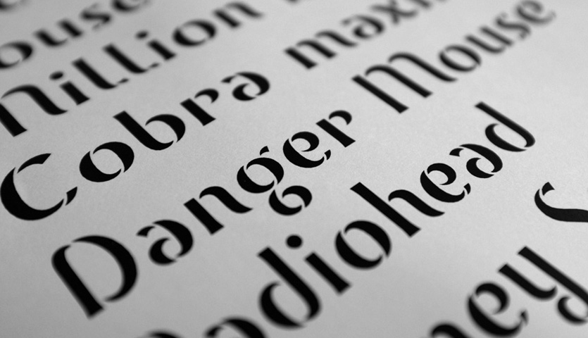
Figure 1. Sample image of Dada typeface.

Designed by Rasmus Lund Mathisen while undertaking an internship at Novo Typo in Amsterdam, Dada is a gorgeous example stencil typefaces.

Dada was originally created as part of an alternative superfamily,it looks stunning in print work and it reminds me of the type currently being used by Coca Cola in their current campaign, only better.

I really love the stencil like details on this typeface, with qualities that closely resemble brush strokes at varying contrasts. It would look great in situations where you want your content to convey that extra bit of class.

Basic Terminology

Throughout all the type related articles on this website there are many different terms used to describe specific aspects of typography. Many of them are explained since most articles are focusing on a specific aspect of typography, but this article will focus on covering the more generalised terms, to ensure readers have a solid understand of the basic terminology in a discipline that is rich with its own language.

Type diagram and terminology

Figure 1. Characteristics and terminology.

Figure one shows a diagram containing common characteristics in a typeface. The more familiar you become with them, the easier it will become to talk about and recognise various fonts on sight.

Some of the labeled details are explained below along with some extra definitions that will any anyone on their way to learning the basics.

Baseline

The baseline is the line at which text appears to sit on. Some rounded letters like u, o and g may slightly extrude past this line but doing so allows for a much more natural looking letter form.

X-height

The X-height is the line at which the top of a lowercase x appears to sit under, this is relative to the font and is generally the same height for all other lowercase letters too.

Cap Height

The cap height is the line at which all capital letters rest, which is slightly smaller than the ascender line.

Ascender line

The line slightly above the cap height. Letters such as l, h, b and d have stems that are slightly taller than the height of capital letters.

Descender

Descenders are strokes that go below the baseline, such as in the letter j, y, g, p and q.

Diacritics

Diacritics are ancillary marks or lines that are added to a letter in the latin alphabet to change the sound value of letters, this is much more common in other european languages that aren’t english.

Leading/Line height

The space between lines of text, referred to as leading because in traditional typesetting strips of lead were used to space lead, this is now more commonly referred to as line height on the screen. A typical practice is to set the line height at 1.4 times the font size, but this can sometimes be set larger too, particularly in sans-serif fonts.

Point

Points are used to measure the size of a font, one point is equal to 1/72 of an inch. When type is set at 12pt, it is 12pt from the bottom of the character box to the top, which can be slightly larger than the actual letters themselves, so as a result two different fonts set in 12pt type may not necessarily be exactly 12pt.

Kerning

Kerning is the reduction or increasing of space between individual letters to make them appear more solid, or to give specific letters a little extra breathing space.

Tracking/letter spacing

tracking is the consistent spacing between letters in a word or block of text that affect it’s over all density and texture. It is not advised to track body text at all, except under exceptional circumstance.

There are many, many more samples of terminology in typography, but these are mostly considered the basics, and once learnt they can easily be built upon and really help people to develop a much deeper understanding of what typography is and how to effectively use it. For a much more comprehensive list of terminology check out FontShops Typographer’s Glossary[1].

Footnotes

  1. [1]Unknown. (Unknown). Typographer’s Glossary. Available: http://www.fontshop.com/glossary/. [16/08/2013].

Hyphens, En and Em-dashes

Despite the fact that this article is more punctuation oriented instead of the usual typographic theory, it should come as no surprise that both are closely related. It’s also important to realise that in order to effectively use typography it’s important that you have a solid understanding of the written language.

So this article will be focusing on something I previously knew relatively little about and is perhaps one of the most neglected and misused forms of punctuation, that is the hyphen, the en-dash and the em-dash.

“these three different marks have very different purposes, and using a hyphen to do an m-dash’s job is just as much of a punctuation error as using a question mark in place of a comma.”

–Ilene Strizver [1]

As Ilene states each of these marks has it’s own unique purpose, so I’m going to provide some information about each of them and show working examples of how they are intended to be implimented.

Hyphens

Hyphens are the shortest dash of the three and it can be located on your keyboard, next to the zero key. They are used to break words at the end of a line, to help reduce the rag in a body of text, which is the uneven vertical space. This is usually referred to as hyphenation.

Hyphens are also used to connect compound words, but to explain when exactly you can do this would require an entire article[2]. Some examples of hyphenated compound words are self-serving and anti-establishment.

Hyphens also symbolise relationships and interestingly as noted on Linotypes article on this very topic[3], The Brown-Jones Theory (with a hyphen) and The Brown–Jones Company (with an en-dash) actually mean two different things. The first instance with a hyphen indicates one person, whereas the second instance with an en-dash indicates two people.

En-Dashes

En-dashes are bigger than hyphens but half the size of an em-dash, you can easily remember this by the similarities between the en and em sizes in typography, which are relative measurements based on a font size[4].

They are used when indicating a range of values like a span of time 13:00–14:00 or Monday–Friday. You can also think of them as replacements for the words “to” and “from” and they can also be used to replace hyphens when you combine open compound words[5].

To get an en-dash on a mac you just need to press option + – (hyphen). On windows you can use the four digit alt code alt + 0150.

Em-Dashes

The Em-dash is the longest of the three. They can be used to represent a change or break in thought, but it’s advised to use them sparingly in formal writing. When used in informal writing however, they may replace commas, semi colons, colons and parentheses for added emphasis.

To get an em-dash on a mac you can use shift + option and – (hyphen key). On windows you can use the four digit alt code alt + 0151.

It’s the awareness of little details like this that can make the difference between good typography and great typography, because no matter how well set a piece of content looks, the credibility can be damaged if there are noticeable spelling, grammar or punctuation mistakes.

Footnotes

  1. [1] Ilene Strizver, n.d., Hyphens, En-dashes and Em-dashes – Fonts.com [Fonts.com], [online]. Available:http://www.fonts.com/content/learning /fyti/glyphs/hyphens-and-dashes [13/08/2013].
  2. [2] undefined, 09/05/2005, Compound Words: When to Hyphenate [Get it Write Online], [online]. Available:http://www.getitwriteonline.com/archive/ 042703compwdshyph.htm [13/08/2013].
  3. [3] Monotype GmbH, info@linotype.com, 01/10/2006, Learn about Type – Akira says … , [online]. Available:http://www.linotype.com/2705-20904/ hyphensendashesandemdashes.html [13/08/2013].
  4. [4]Phillip Patterson, 31/07/2013, Line Lengths & Measures [Type & Music], [online]. Available: http://typeandmusic.com/line-lengths-measures/[13/08/2013].
  5. [5] Jane Straus, n.d., Dashes | Punctuation Rules | Em Dash | En Dash [Grammar and Punctuation | The Blue Book of Grammar and Punctuation], [online]. Available:http://www.grammarbook.com/ punctuation/dashes.asp [13/08/2013].

Fonts & Typefaces

As a graphic/web designer or a typographer it is vitally important that we learn to properly use terminology that comes with the practice. However, for many designers typographic terminology seems to be an oversight and one of the most misused terms is by far the use font and typeface.

Font Vs Typeface

The words font and typeface can’t be used interchangeably [1] because they mean to separate things. A typeface refers to the actual design of a type family, whereas a font is the device that is used to display a typeface, whether it be physically of digitally. This may still sound confusing and that’s okay, it will be explained in more detail as we go on.

To help create a clearer picture of how each should be used we can look at what is known about the origins of each word.

Johannes Gutenberg employed a scribe by the name of Peter Schöffer to help design the first typeface, this entailed the actual design of each of the 202 characters and their transformation into metal type, so we can think of a typeface in terms of it’s design and entirety of a type family.

As to the exact origin of the word “font”, no one is sure for certain but there are a number of seeming logical theories of which esteemed type designer David Berlow[2] comments that the word is most likely of french origin where the idea of a spring of water (Fontaine) was close enough to the ideas that spring from words.

Jim Rimmer also theorised that the word “font” came from the word fount which is still used in the UK, meaning a source from which words spring.

Allan Haley[3] has the following to say about distinguishing between a font and a typeface.

“Graphic designers choose typefaces for a project but use fonts to create the finished art.”

For Type & Music the typeface I chose is Kepler Std by Adobe type designer Robert Slimbach, but the font I use to display the content is Kepler Std light. Typefaces are designs like Helvetica, Georgia and League Gothic. Fonts are what we use to print these typefaces, physically and digitally. So creating a typeface and creating a font are two different things.

A deeper explanation

Hopefully the difference is starting to make more sense to you, but if it’s still confusing, and it can be, read on for an excellent section I decided to include from The Font Feed’s article Font or Typeface[4].

The first terminology we agreed upon was in which situations we’d use font and whentypeface. Mark Simonson once recapped it handsomely in this discussion on Typophile. The gist of it is that

“the physical embodiment of a collection of letters, numbers, symbols, etc. (whether it’s a case of metal pieces or a computer file) is a font. When referring to the design of the collection (the way it looks) you call it a typeface.”

Nick Sherman used an interesting analogy in a comment on Typographica’s Our Favorite Typefaces of 2007:

“The way I relate the difference between typeface and font to my students is by comparing them to songs and MP3s, respectively (or songs and CDs, if you prefer a physical metaphor).”

Stephen Coles agrees:

“When you talk about how much you like a tune, you don’t say: “That’s a great MP3”. You say: “That’s a great song”. The MP3 is the delivery mechanism, not the creative work; just as in type afont is the delivery mechanism and a typeface is the creative work.”

By now you should have a much more solid understanding on how to differentiate between the two and you can now keep this in mind the next time you are talking about fonts or typefaces. It can still be tricky getting it right though so I think it’s something people should take the time to think about before using either word to describe something, but over time you can be sure it will become second nature.

Footnotes

  1. [1]Harrison Weber, 20/05/2012, Is it a Font or a Typeface? [The Next Web – International technology news, business & culture], [online]. Available: http://thenextweb.com/dd/2012/05/20/is-it-a-font-or-a-typeface/ [12/08/2013].
  2. [2]Yves Peters, 11/09/2008, Font or Typeface? [The Font Feed], [online]. Available:http://fontfeed.com/archives/font-or-typeface/ [12/08/2013].
  3. [3]Allan Haley, 21/10/2012, AIGA [They’re not fonts!], [online]. Available: http://www.aiga.org/theyre-not-fonts/[12/08/2013].
  4. [4] Peters.

City Flickers, Quivion Mix 18

Quivon image

This dark and wonderfully atmospheric mix by Quivion blends a collection of experimental, ambient, techno and electronic genres together into one beautifully natural mix.

Featuring tracks from the Blade Runner Soundtrack, Andy Stott, Pole and Teleferick among others. This is a great mix and well worth checking out for anyone who is a fan of dark experimental and ambient genres.

I’ve listened to it countless times by now and I still love it. It’s especially enjoyable at night, in a dark room with headphones. You can check it out for yourself over on SoundCloud.