Numerals, Capitals & Small Caps
The correct use of numerals, capitals and small caps are essential for good typography. Unfortunately though, to many people they’ve become a complete oversight and the theory behind their correct usage has been all but forgotten.
Historical Context
The numerals we now use today are known as Arabic and Indian numerals. They originated around 300 BC and were later adopted by Arabs during the 2nd century BC, and were later integrated into use with latin alphabets, replacing roman numerals[1].
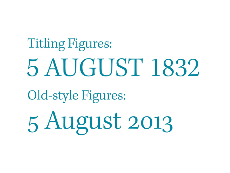
These arabic numerals were known as lower case figures or old-style figures because they ran in line with lower case text, unlike the titling figures many of us are accustomed to seeing nowadays. Text figures were common in European typography from 1540 to around 1800, but during the mid 18th century shopkeepers and merchants were writing numerals themselves, so eventually they developed their own proportions.
These figures became known as titling figures which are also known as ranging figures, lining figures and modern figures, whereas text figures are also called non-lining figures, lower case figures, hanging figures and Old-Style figures[2].
During the 19th century foundries stretched the smaller text figures to fit the full cap height and titling figures became a normal practice in commercial typography, despite the fact that this is bad typographic practice. Letter forms should never be stretched or squashed simply because it alters their original intended display.
During the early 20th century old-style figures underwent a revival of sorts in which they found their way back into use in books, but titling figures remained in news and advertising papers. The figures remained largely in exile or misuse though and with the arrival of computers and desktop publishing, many of these features were originally unavailable.
The correct use of these figures has since begun to prosper again, with Adobe and Microsoft working together in the 90s to create a digital font format known as OpenType, a format that supports the use of additional characters like Small caps, old-style numerals and ligatures. This is now supported on desktop applications by Adobe and Quark Express. In recent years there has even been increasing support for them in web browsers.
Correct Usage
There are a collection of guidelines that you can follow when setting type to ensure that you use each of these figures appropriately and each will be explained below.
Numerals
“The using of titling figures in running text is illiterate: it spurns the truth of letters.”
-Robert Bringhurst – The Elements of Typographic Style
When working with numerals use titling figures with full caps and text figures in all other circumstances. This helps maintain the flow of text, where titling figures to be used in the middle of body text or text figures in the middle of capitals, they would draw unnecessary attention to themselves and it’s ill advised in Robert Bringhurst’s The Elements of Typographic Style.
When using numerals in tables you can use OpenType features to switch between proportional numerals and tabular numerals, it’s possible to do this on both titling and old-style figures.
Capitals
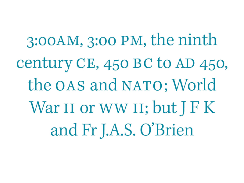
When using capitals in the middle of text a good rule to keep in mind is to use spaced small caps for abbreviations and acronyms, except for two letter geographical acronyms and acronyms that stand for personal names.
It’s important to realise too that small caps aren’t just shrunk Full caps, they are designed from the ground up just as roman, italic and upper case letterforms are.
* * *
Successfully implementing the features discussed here should mean you’re well on your way creating great typographic content. These features are easier to implement on desktop applications at the moment, and there is continuously improving support for them in the browser, which I’ll cover in much more detail in a later article.
Footnotes
- [1] Robert Bringhurst, 2004. The Elements of Typographic Style. Version 3.2 USA: (pp.46-49). Hartley and Marks Publishers.
- [2] undefined, 12/07/2013, Text figures – Wikipedia, the free encyclopedia [Wikipedia, the free encyclopedia], [online]. Available: https://en.wikipedia.org/wiki/Text_figures.