Tribal Alliances & Families in Type
To many people the selection of font weights and styles is simply an aesthetic choice, intended to serve the contents needs, but in actuality there are rules and guidelines to follow that determine which weights and styles should and can be used together.[1]
“To the marriage of type and text, both parties bring their cultural presumptions, dreams and family obligations, accept them.”
-Robert Bringhurst, The Elements of Typographic Style
Historical Origins & Development
There is a rich and diverse history behind the combining of font weights and styles, upper case and lower case letters have been around for over 1,000 years, but they haven’t always been used together.
Originally text was set in uppercase and over time, hand writing eventually transformed capitals into simpler more round letter forms that became our lower case alphabet. It wasn’t until much later that the two began to be used together and it was only during the late renaissance that typesetters began to combine roman and italics, before that italics had been reserved only for prefaces, headnotes, side-notes and block quotes.
Bold and condensed typefaces originated in the late 18th century and have been used more and more to replace headings and italics, especially on screen where italic texts can be harder to read.
The points mentioned are important to note because many older typefaces that have since been reproduced digitally now include these new weights and styles which did not exist at the time of their initial creation, so staying true to the original form means omitting these newer additions.
There is help though to aid the designer in choosing combinations that compliment the original forms and stays true to the established hierarchal rules that can make your content look and feel more harmonious.
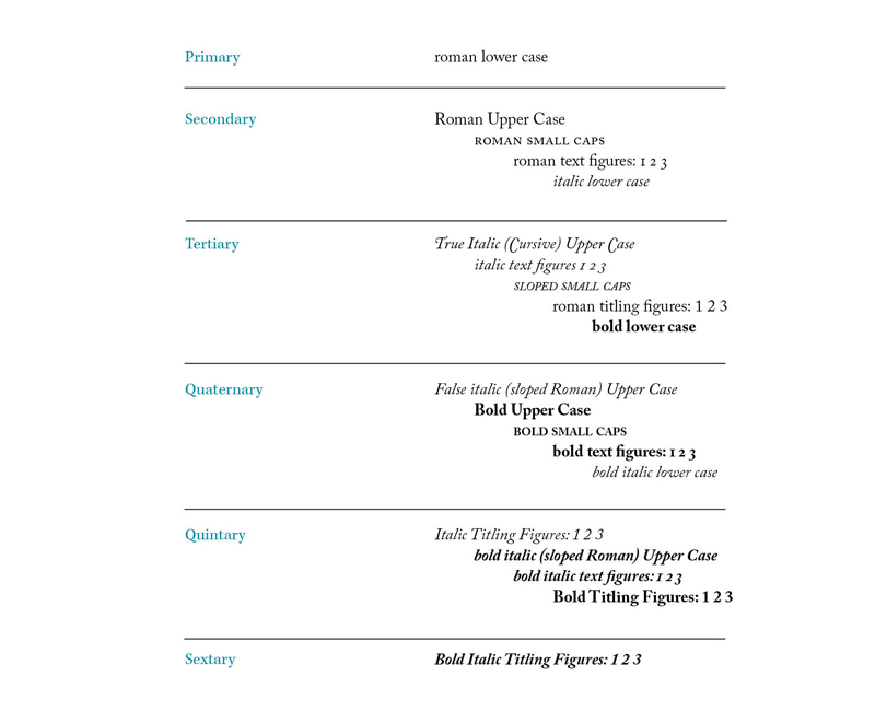
Figure 1. Tribal alliances and families in typefaces.
Figure 1 serves to show how each style and weight is categorised.
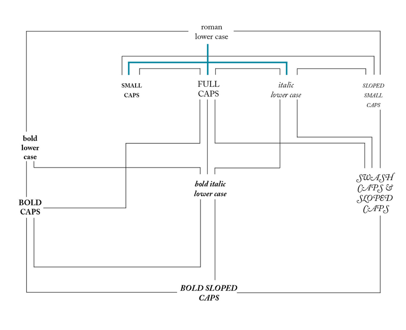
figure 2. Grammatical road map of conventional large family of type.
Figure 2 shows how styles and weight should be combined. The blue line represents the primary type family and the dark line shows the extended secondary family. By following the diagram it’s acceptable to use roman lower case along with bold lower case, small caps, full caps and italic lower case, but not bold italic lower case, bold caps, swash caps or sloped small caps. Doing so disrupts conventions of typographic grammar.[2]
Using styles & weight Correctly
With such a wealth of weights and styles it can be tempting for people to feel that they should utilise all features of a typeface, but the grammatical road map helps show otherwise and it’s wise to change only one parameter at a time as stated in Robert Bringhurst’s Elements of Typographic Style.
To create balance on a page the weight of larger text sizes should slightly decrease in comparison to the body text, this can help prevent the eyes from becoming distracted by strong headlines that demand attention.
When using bold text it’s advised to keep punctuation in the background, i.e roman, since it’s the word or sentence you are drawing attention to, not the punctuation. However, when spelling in italics it’s advised to keep punctuation in italics too, since letterforms may collide or look out of place next to punctuation that’s set in roman.
Following the rules and guides laid out in this article will help your content establish a visual typographic grammar that is balanced and harmonious, improving the overall design, composition and readability of your content.
Foot Notes
- [1]Robert Bringhurst, 2004. The Elements of Typographic Style. Version 3.2 USA: (pp.53-69). Hartley and Marks Publishers.
- [2]Mark Boulton, 18/05/2005, Five simple steps to better typography – Part 5 | Journal | The Personal Disquiet of Mark Boulton [Mark Boulton], [online]. Available: http://www.markboulton.co.uk/journal/five-simple-steps-to-better-typography-part-5 [06/08/2013].